Categories
visual studies

St. John’s Community Centre

We were asked to create a banner for St. John’s Community Centre in Cambridge. As resulted, I did a mind-map to find more ideas and to see what could be put on this banner.

I then moved on to thumbnails to get a very rough ideas of the composition and also to see what could be put on it.

I first thought of many things to be on there but then I realised it might not get people’s attention if there are to many images of whatever that will make it look too busy. Therefore, I decided to start on the outcome. These below were just some tryouts, I drew out an illustration of St. John’s community centre in which I like, thus I used it for every tryouts. I know that these tryouts including the final outcome have very different styles as I wanted to also explore on different ways and styles of the design.

After these two tryouts, I didn’t really like them, therefore, I went on Pinterest to find some more inspirations for the banner and I thought to myself, why don’t I try out brighter colours to attract the audience. As resulted, I used quite vibrant colours. Moreover, I have introduced a lot of the organic shapes as I felt the colours will suit more to the solid shapes instead of doing mainly collage or photomontage.
Categories
visual studies

Photomontage

Another 2 weeks project is introduced and the activity was to do a photomontage of anything we wanted, therefore, I started off with a mind-map of ideas.

After I thought about the layout, I then went on to Pinterest to find aesthetic pictures for the photomontage. The process was done through an application called Procreate.

Categories
visual studies

week3 – The Phoenix Project

During this final week, I went to Care’s house and she’s the partner who I am collaborating with. Our plans was to do 2 samples first, before the final one. Moreover, the materials and tools we used were acrylic paints, a variety of different paint brushes, 3 sizes of canvas that already has gesso layered as a based in small, medium and large, water bucket for brushes, and lastly, a speaker for the music.

The pictures above show how we set up this experimental study.

The first piece is then done, using the smallest canvas size. The way it came out was really interesting. I was really fascinated with the result.

The second piece was done with the medium size canvas. My respond is on the left and care’s on the right. We wanted to approach how the same piece of music can illustrate different emotions and reactions.

Lastly, the final one with the largest canvas size, the same again, mine is on the left while Care’s on the right.

We decided to record the last respond and this is the link to it.

To summarise, I think it came out to be very expressionism in which also compare each other’s respond in one canvas. This actively demonstrates that we visualise the same situation differently, thus it is very unique to us. For me it’s a piece of reincarnation, where everything died and grow again repetitively. The music itself is very much powerful, many stories and emotions are all inside this one piece.

Categories
visual studies

week2 – The Phoenix Project

This second week, I decided to have another 2 goes at drawing out the expressionism pieces in which I found in to be a little different from last time and use different media, iPad, to put down the emotions I feel when listening to the music.

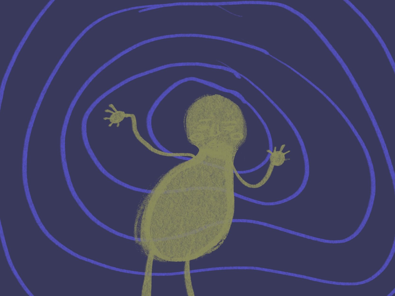
The way it came out to be is very abstract, especially for the second respond. Despite using similar colours for both pieces, I wanted to use a variety of textures, therefore I tried out fine lines, water colour brush, and acrylic brush. In addition, I can also feel different emotions in these 2 responds which is how I wanted to come out as.

Categories
visual studies

week1 – The Phoenix Project

The Phoenix Project is a visual and performing arts collaboration between CSVPA Arts Lab and composer Professor Richard Causton from King’s College, university of Cambridge and it is an amazing opportunity for me to create an outcome respond to Richard Causton.

“Phoenix”, a music composition written by Professor Richard Causton for flute, clarinet, violin, cello and piano was the winner of a 2006 Royal Philharmonic Society Award.

The mind-map on the right hand side shows how I think pf the music when I first heard it.

I am going to be working with a partner called, “Care” and she is a graphic student in CSVPA. The reason why I want to do this artist respond with her is because I am intrigued in how and what we will produce together as we have different brain and therefore, different perspective towards the visual. Our idea is to create an expressionism painting. However, before going into that stage, I want to do some tryouts and also look at how it could turn out.

As a result, I had another go at listening to the music and during that, I also draw out random shape and lines to show how I feel using a pen and this is how it turns out.

My first expressionism draw out.

I actually really like how this turn out, thus I think it is very expressive.

Categories
visual studies

Surrealists Art

We got introduced to a surrealists art topic which were very fascinating. The activity that we did as a class was to draw one part out of 4 which are, head, body, legs and feet. Each of us got given different section to do and for me, I got feet. As we were talking about the surrealists, this lead me to an idea of doing a completely surreal feet.

My surreal feet.

I thought it would be very fun to use heads as feet, which also got me thinking further of how would the faces look then, for me the way I imagine has come out as I expected to be. I really enjoy drawing them, thus I got really feedbacks from my teacher and classmates.

Categories
visual studies

Experimental studies – Distortion

I have experimented with procreate to come the different distorted shape through a tool called Liquify.

I selected one image I made out of the three and started a hand drawing using EE pencil. The result is as below.

Categories
visual studies

Visual Studies – Figures and Postures Drawings

We have got given pictures of a women with different postures to do quick sketches with each post of the time limits of 1min, 2mins and 5mins. Therefore, we were to produce 3 sketches for each post.

The first post was a tryout where we all did it at the same time. As a result, we only did a brief 2 sketches of 1 and 2 minutes. These hand drawings were done using pencil and paper in the traditional way. However, for these to look cleaner, I have further develop them in Photoshop where I edited these sketches for a better visualisation.

After we did 2 sketches together as a class, we got given a task to finish the rest of the pictures individually and these sketches below are what I have produced.

The way we have learn to sketch these are by looking at the spine of the model, which direction of curve does the spine position, moreover to look at the body as different shapes instead of just draw where the outer lines are but to visual through her body and analyse which shape of it is there and so on.

This session has given me a better understanding of how the figure works. Which enlighten me to initiate the differentiation of the shapes and lines in there, thus the repetition has also help me to improve as I get to practice.

Categories
visual studies

Visual Studies – Self Portrait Expressionism

We are still in the expressionism topic and today, we have done 5 different expressionism of emotion drawings which are self portraits and the way I did them was by using Procreate on my iPad.

Fear
Joy
Disgusted
Euphoria
Shock

Categories
visual studies

Visual Studies – Expressionism Development

We got introduced to torn paper technique, this next piece is a developmental piece which is an expressionism piece with a paper torn technique. However, before starting on it, I went onto the internet and searching for an expressionism painting to use it as my inspiration colour palette.

ERNST LUDWIG KIRCHNER (1880-1938)
‘Davos under Snow’, 1923 (oil on canvas)

The image above shows my colour palette inspiration and I have used the same mug photo as last week which is a portrait of Georing Hermann.

I used highlighters to produce a colour palette and continue to tear them up into smaller pieces, then arranged them onto another piece of paper which I used for background to create a portrait of the man in the picture above. However, these were done in my own style.

My final outcome

I like the way this came out, as it gives an abstract look to it. The textures have also shown an interesting visual giving the cool effects onto the piece. There are lots of different emotions in this outcome and I think this was due to the variety of colours on there which I really like.