Categories
Uncategorized

Photography Workshop – Manual Setting

In today’s photography session, we have learned how to take picture manually. This includes shutter speed, aperture and the panning shot. We use the light metre to help us to balance out the exposure, so it’s in the right measurement. These below are all the photos that was taken by me.

We then get to do posters that illustrate each techniques through photoshop, and these are what showing below.

Overall, the activities that I’ve done, has given me the knowledge of how the camera works and help me to improve my skills and this can also be adapt to take pictures of my portfolio in the near future.

Categories
Uncategorized

Unit 9

This is the last unit of year 1, Extended diploma and what we’ve been doing is researching the universities over the UK. I have done a university comparison worksheet and a practice of personal statement when applying for these universities.

Categories
Uncategorized

Digital Portfolio – Year 1 Practice

Quick Animation.

These pictures above are my art work that I had created during unit1-8. Moreover, I have tried to include many different techniques. For example, digital collages, prints making, drawings, photography, etc. I want this portfolio to be eye-catching. Therefore, I tried to arrange them into categories and make them in order. For the first two collages, I put them up first because I think that they are the most interesting one as the meaning behind is about the coronavirus and how it is affecting us, also giving us the “New Normal” lifestyle which of course then gave me the ideas of how to interpreted this meaning through doing collages. Moreover, I gained the thoughts of colours and solid shapes through magazines and posters to create these two pieces. The third picture is another collage that I made for the protest project at school and it basically about pollutions and how the people who have the most power can just ignore the fact and telling everyone that it’s a fake new.

Later down the page, I have put a GIF that I made combining with collage ideas, adding movements with solid colour shapes. After that I put the moving image which is a 10 seconds long animation. The following piece is the mask that I have made in 3D class and it included many techniques which are, paper Mache, clay moulding, paintings, wire shaping.

Lastly, I wanted to show many different skills that I learned throughout the year and therefore, I uploaded printings, tie dye, live drawing and photography.

Categories
Uncategorized

Peer Review Assessment form

This week lesson, we got put into a small group and shared our blogs together to see what can be improved and developed. We then had to fill in the form so it can be assessed. The blog I did a review on is Emily’s and this is the link to her blog.

https://zipingblog.wordpress.com/blog-feed/

Categories
Uncategorized Unit 8 - FMP

FMP week 1,

For this first week of unit 8 or what we called The Final Major Project (FMP), I have started to plan by doing a mind map and throwing in all of my ideas which I found quite helpful as I can then later on organised them.

After the mind map, I then arranged my ideas into sentences and put those into the project proposal for the teachers to see and know what I wanted to do and so they can help to guide me for a better quality project.

I went and find loads of pictures that relates to what I wanted to do on Pinterest to create a mood board to see the theme of the project visually.

Mind map
Mood board

The overall or what I got so far was a fun process for me, finding pictures or putting ideas down was very fascinating. I used a lot of the secondary pictures which I then cut into collages to make it more interesting, I’ve also put some labels on there just to get some words across and I am happy with the end result. The next thing I’ll be doing is researches which will definitely take some times.

Categories
Uncategorized

Unit7 – Animated GIF.

In this unit, for Graphics and illustrations, we learned how to create GIFs in both two weeks. For the first week, it was all new, so for me it was a getting familiar with the tools lesson, so I only did a really simple shots of collages that were in a sequence by trying to get each shot into the right angle and frame. This is how my first GIF came out and as there were limited time with not used to the tools in the application, it looks quite rushed and not neat.

First animated GIF.

For the second week, I did my second GIF, which this time, I used an image that I took from the previous unit. The mask that I did and photographed, I used that to do several collages on my iPad first as it was more convenient. After I got 10 different collages, I went to photoshop and turned them into a GIF and I think that I did the second GIF much better than the first one, there are more details and also the colour combinations were also what I like.

Second animated GIF.
Categories
Uncategorized

Unit4, week2 – evaluations and reflective writing of outcomes

For this second week, I’ve learned more workshops which were etching, digital drawing, heat transfer printing, aperture, clay work, using green screen and for me I think the second week workshops are a bit more challenging than the first week which made it more interesting.

Etching and Printing it out

In this lesson, I learned how to etch onto the plastic plate using a stylus and I found out that it works similarly to the pencil, using pressure, so if I put more pressure onto the plastic plate, the print that will come out later will have a darker outcome compare to the lighter pressure lines that did. I also wanted my outcome to be quite expressive and so the lines that I make onto the plastic plate are dark and rough giving out that mood.

The printing process takes up quite a lot of time because I had to make sure that there are no excess ink on the plastic and that it shows all the line clearly which was difficult as the ink was very viscous and so it was already hard to spread it on. The actual printing bit though was the easy bit. I used the blotted paper to be the background and I transfer the print onto the blotted paper by using press machine.

The process of making was fun and I wish I could have more time to experiment with different backgrounds and may have put different colours onto it making it more colourful.

Digital Drawing

In this workshop, I’ve learned different tools and what can be done on photoshop and what we’ve learned was how to draw using drawing tablet as tools. I tried a range of brushes and also how it looks texturally and what I like about it was that it’s easy and I can just delete the mistakes by pressing buttons and not to do it physically.

I also like how the two colours can be shown when overlapping each other making those colours look transparent. I found out that there are so many things that can be done on photoshop and that made it looks complicated for me because there are so many buttons that everything looks everywhere making it confusing. However, learning it slowly and taking each step not too big can really help and that’s what I did on this workshop.

Heat Transfer Prints

I’ve learned another type of printing today and this was in the textiles lesson, this type of print is to print on fabrics and I created patterns using resists. I found this type of printing really fun as I can choose patterns, colours and textures making it more interesting compare to other type of prints.

There were so much more methods in this print compare to other type of print and also the heat transfer machine could be quite dangerous if not careful but I think it was a good experience to have and to get to experiment with these things can be rare.

For me to improve, I think it could be that I make it more meaningful for the other two prints I’ve made because I only have 1 meaningful print but not for the other two.

Clay

For the clay lesson, I learned how to make textures using many types of tools and the textures I made was inspired from the previous work that I did which gave me the idea.

I got to experience 2 types of clay, one got bits of grains in it giving a little rough texture and the other one has a really smooth texture made it really satisfying to work with.

We used the rough clay to make texture samples and the smooth clay for making vessel and the process of making these were really enjoyable and to improve, I could have done more texture on the vessel with both techniques.

Aperture

We learned how to take pictures with the camera to understand how the amount of light can be used in an exposure to make things in the background blurry with the name of aperture. High aperture makes everything clear and low aperture makes the background blurry.

For the low aperture, it is more common with portraits photos whereas for the high aperture, it’s more common when taking landscapes. I got to take these pictures using the camera and make the same picture different by changing the aperture. It was first difficult as I didn’t really see the different between the high and low aperture and I think this was because of the light in the surrounding and that it can affect the camera.

However, after many tries, I got a hang of it and finally can make the same pictures look different with the blurriness in it.

Using Green Screen

In moving image, we learned how to merge the video together and how to make it look the most realistic. We also learned how to use the green screen and how to change it into different backgrounds.

The lesson was really fun and interesting, we got to do a group work and I came up with the idea of us flying through the city like the power puff girls. I think that I’ve gain so much soft skills and that it was so exciting to wok with different people.

The final result came out well. However, to improve, I think that it can have a better quality of editing the video and it could also be a little longer for few seconds.

Overall, it was a really good experience and I would want to try it again in the future.

Categories
Uncategorized

Unit4, week1- Evaluations and Reflective writing of outcomes

For this whole week, we’ve been doing many workshops on a wide range of subjects. I learned monotype prints from Fine Art, wire modelling from 3D, Typography from Graphics and Illustration, how to use sewing machine in textiles, hand drawn animation in moving image and shutter speed in photography. These experiences have open my eyes up which I found very fascinating.

Monotype Print

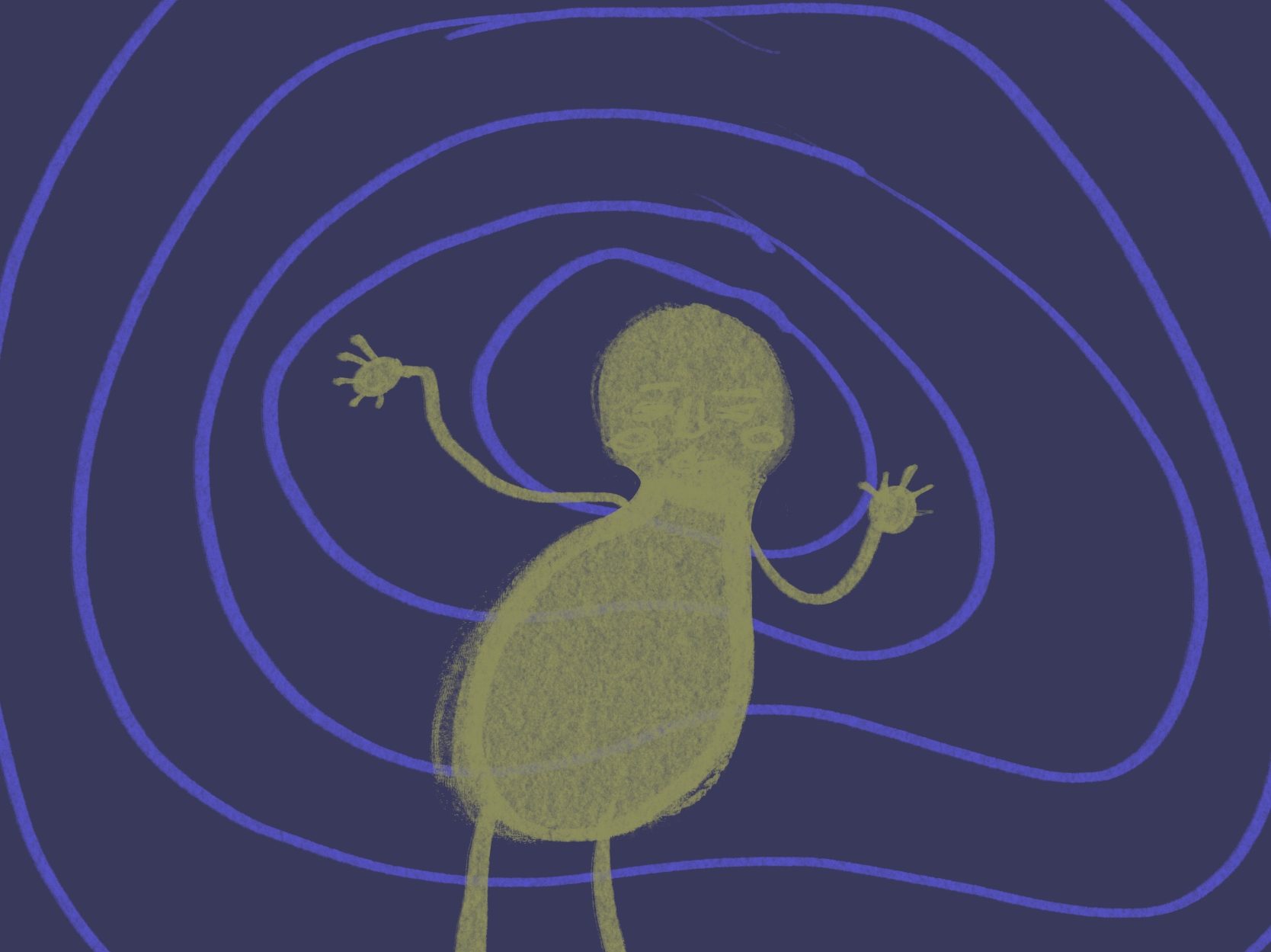
For this first lesson of the week, I learned monotype print which includes 4 different techniques, positive and negative direct trace, positive and negative direct draw, reductive and stencil and frottage. I first thought it was going to be difficult using ink but as I started doing it, it was actually really simple and not too complicated. I found doing direct draw the easiest and I also try to used my previous outcome from the unit3 as my inspiration and reference to do these monotype prints.

The things that I could do to make these prints look better was to experiment with them more, maybe try using more colours or do more of the printing process to have a variety of samples. Also, I didn’t have enough time to do my other negative direct trace, which was a little disappointing but I think I’ve done enough to present all my works.

Wire Modelling

I did this in 3D lesson and it was the first time for me handling with the wire, we’ve learned how to connect the wires with 5 different techniques, 2 wire twist, interlock, u-channel, jump ring and coiling. We also learned how to draw with wire and how to use wire mesh to create the silhouette of the shapes from fruits and vegetables.

I was not familiar with the wire and so it was difficult at first and took a while to get a hang into. Especially with the drawing wire, I used the drawing that I drew in visual studies to be my reference and at first, I didn’t really know what was going on but then after a while, it started to look more similar to the reference and that was a big relief for me at the end and it was also one of my favourite outcome during that week.

To improve, I could make it neater and maybe thought more about how the shadows might be shown through the light shining, like it could look different the what we see on the real thing and the shadow which can definitely make it more interesting in a way.

Typography

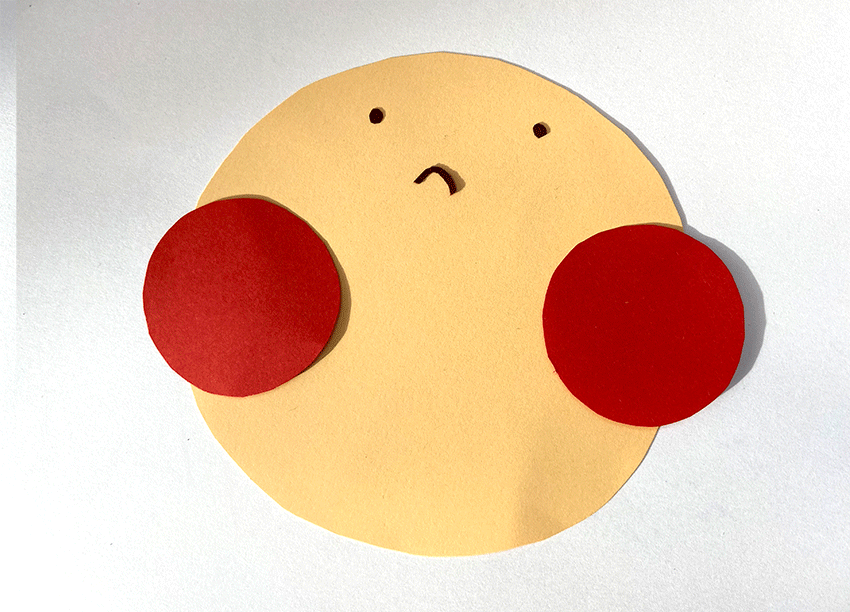
For this lesson, we’ve learned different font types and how using different fonts can affect the mood and the how it can attract the readers which is good to know as it’s appropriate for my later use. The application that I used throughout this process is photoshop.

It was an easy process for me doing this typography and our task was to find the best font to suits with the tittle of Kettle’s Yard.

We also got to do the fonts with our hands using any type of pens or brushes and I mainly used felt tip pens. For me, I think using classic fonts and making it simple suits the title of Kettle’s Yard the best. I think that this lesson was the most relaxing lesson which gives me most ideas to create these many fonts.

Using sewing machines

I’ve have experienced using sewing machine before. Although, I’ve used it before, but It was only for a little bit so for this lesson, I felt like I’ve learned quite a lot. We got to try using it without any thread first to see if we could make straight or curve lines which I found it very useful.

After we used the sewing machine without the thread, we then learned to put in the bobbin and started to sew by doing another samples to see different styles the machine can do and for me it was fun trying out. I used the pleated pattern as my inspiration to do my outcome and during the process, there were some technical problem with the machine and I had to start the machine again for a few times which I found quite irritated but I then got to finish it at the end.

To improve, I think I could have put more patterns onto my outcome and it could have be from the styles of the sewing or from the fabric because my outcome, I think there could be more to it.

Stop Motion Animation

In moving image, we learned how to do animation in stop motion technique, which we get to draw out different scenes and it was exciting for me because I thought it was going to be fun. We got to do 3 different stop motion animation and it was a new thing for me.

We used 2 applications, the first two stop motions we used Adobe After Effects and the last stop motion, we used Adobe Media Encoder. For me, I found the Adobe After Effects harder than the Adobe Media Encoder as I think the tools are much easier to use.

I think I could definitely improve the animation by putting in more details and maybe be a little more creative with my videos to make it more fun to watch but overall, it was a very good try for the first time experiencing these applications.

Shutter Speed

We learned the term shutter speed in this lesson and we also get to used the camera to try different shutter speeds. For me, taking pictures with the panning shutter speed, I found the most difficult, because we got to take pictures of cars during when they were on the road riding and I had to make the car looks clear but the background blurry so I had to move my camera to be the same speed as the car which I had to do it several time to be able to get one decent shot.

However, the fast and slow shutter speed was easier and I found the fast shutter speed easiest to take as I didn’t need my hand to be steady for a long time. The overall results came out good.

To improve, I think I could improve on my planing shutter speed and this could be done by taking more photos of the cars to find a better picture.

Categories
Uncategorized

Unit3 – comparing outcome to the 2 artists research

My outcome that combined both of the artists research

The two artists that I combined were Daniel Libeskind that is an architect and Issey Miyake that is a fashion designer, both artists works are quite in the opposite direction and for me it was challenging at first, thinking of how to combine them together but after taking a little step up, it was easier for me then.

My outcome is more sculpture, 3D like which suits more to Libeskind’s work but then I also try to use the pattern from the Miyake’s work and adapted to the building of Libeskind.

For me, I was more focus on the contextual side of the outcome and as a result of that, my outcome didn’t come out to be something useable but came out to be another art piece that contain meanings behind.

The story behind that I tried to combine, involved culture, politics, history and traditions. I used the politics, culture and history from Libeskind’s work and used tradition and culture from Miyake’s work. For example, the pleated pattern, represents the tradition way because the artists decide to used special materials from his own country showing how it can affect the society, not just in the visually way but also culturally as well.

However, the outcome that I’ve made, didn’t come out as planned. My final design was to have the top of the building white so that it can represents the Jewish people that had died innocent and that they were too clueless to what were going on and that’s how I wanted to come out as but as the time was quite limited, I could only do the black lines that connects to be the shape of the building. Moreover, I chose the background to be black to resembled the dark past and the history that cannot be fixed or changed anymore, even how hard people have tried to cover it up to the society in the political way, it has already happened and this is what most people have forgotten.

I think, for what can be improved if I had more time. It would be to put in more details and maybe bring in new textures and materials so there are wide range of options and this can make it look more interesting for the final outcome. I think I would look into the colours more and how it can be changed in the future.

Categories
Uncategorized

Evaluated blog on design board

I have created a character that was inspired from one of the art piece from the Kettle’s Yard, which was a drawing from Jim Ede’s granddaughter called Jane and the drawing is called, Two Girls, One with a Doll. For my overall design board, I like the colour that I used which involves white texts with black background showing black and white theme.

However, I don’t think the board looks interesting and that was because of how I didn’t manage the layout well and I could have change pictures’ scale by making it larger and the texts sized smaller. From doing that, I think it could be something more.

I could also rearrange the composition of the texts and pictures and maybe try to make the final outcome be the most obvious one by putting it in the middle and enlarge the scale to to be bigger and that’s what I can do to improve in the future.